Advenis REIM

Web design - Developement - Evolutions

Overview

Advenis REIM is the new Advenis’ company which takes over the management of the real estate products after Advenis Investment Managers.
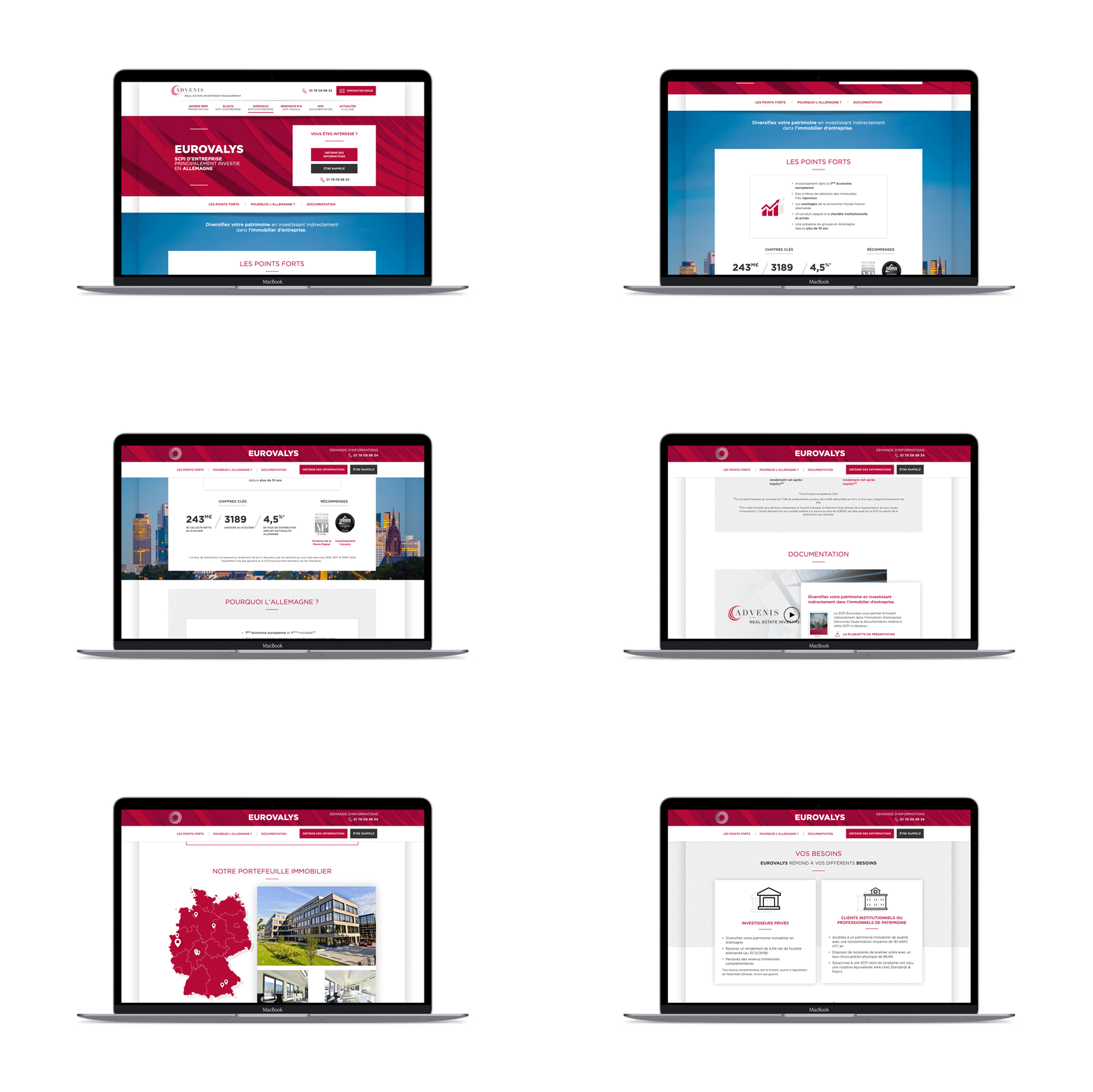
We were asked to rethink and redesign Advenis REIM's website respecting their identity and helping them to highlight their complex products: Real estate mutual funds.
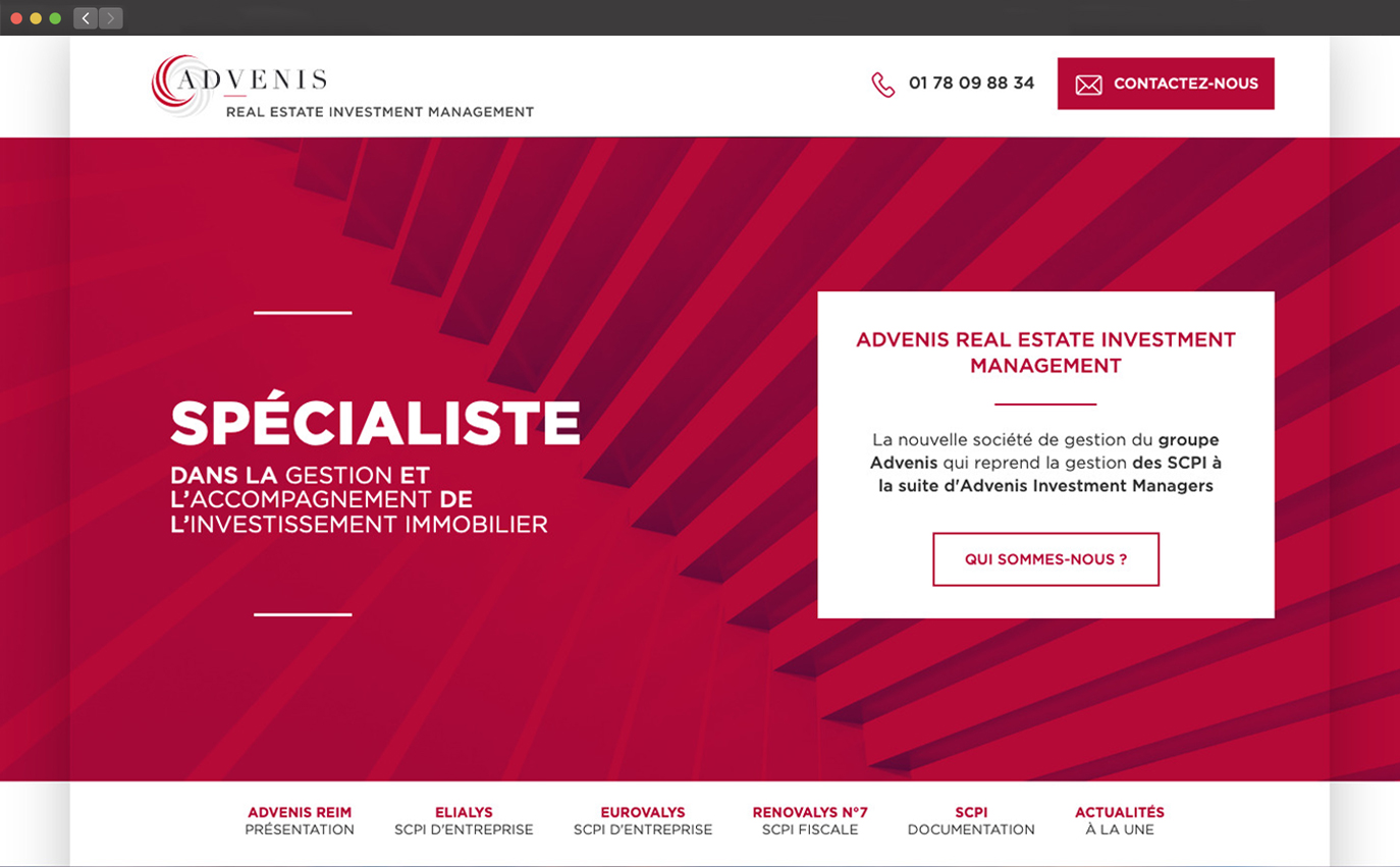
See website
screenshot homepage advenis
Role
  • Project manager
  • Product designer
  • UX designer
Goals
  • New content architecture
  • Improve the communication between users and the company
  • Build an evolutive website that can moves as needed by the client

1. Information architecture

One of the biggest challenge with the product page was the density of informations and documentations, most of them being legally required.

Content strategy
After receiving all the data and text we did a first sort in collaboration with the client, we then help them to prioritize informations depending of their goals and what they want their customer to understand first.

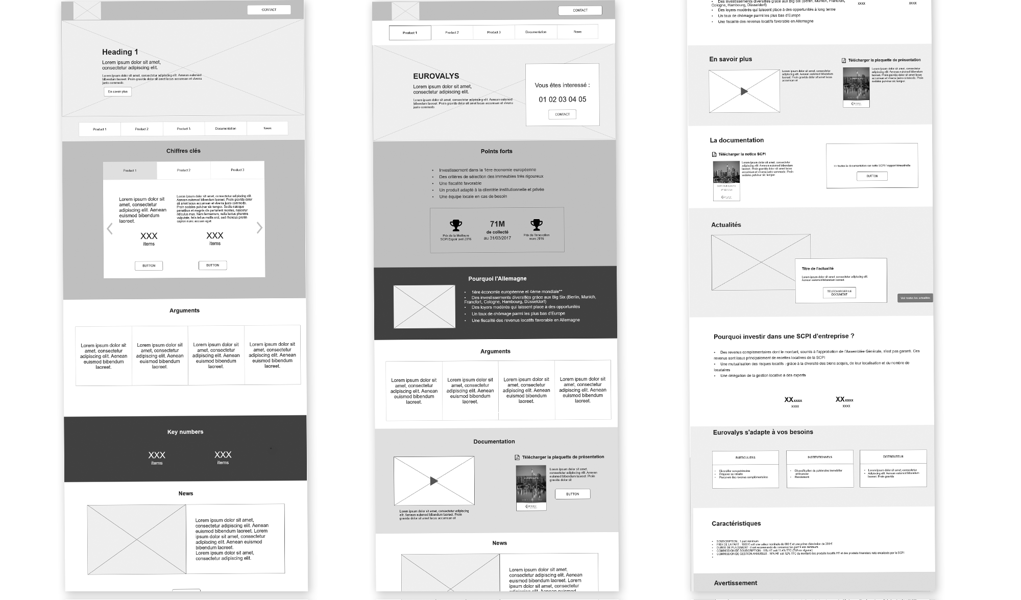
We started sketching different propositions of the 2 main pages and discussed them until we found the one matching client’s goals.
Then we started prototyping and testing our convictions.

Responsive image zoning advenis project

2. Navigation through pages

After few tests we felt that to help user to understand is not only about content, but also about how to be able to find the right information when they need it. With a good architecture and nav he can go to the data they want faster.

Complex page doesn't mean complex navigation
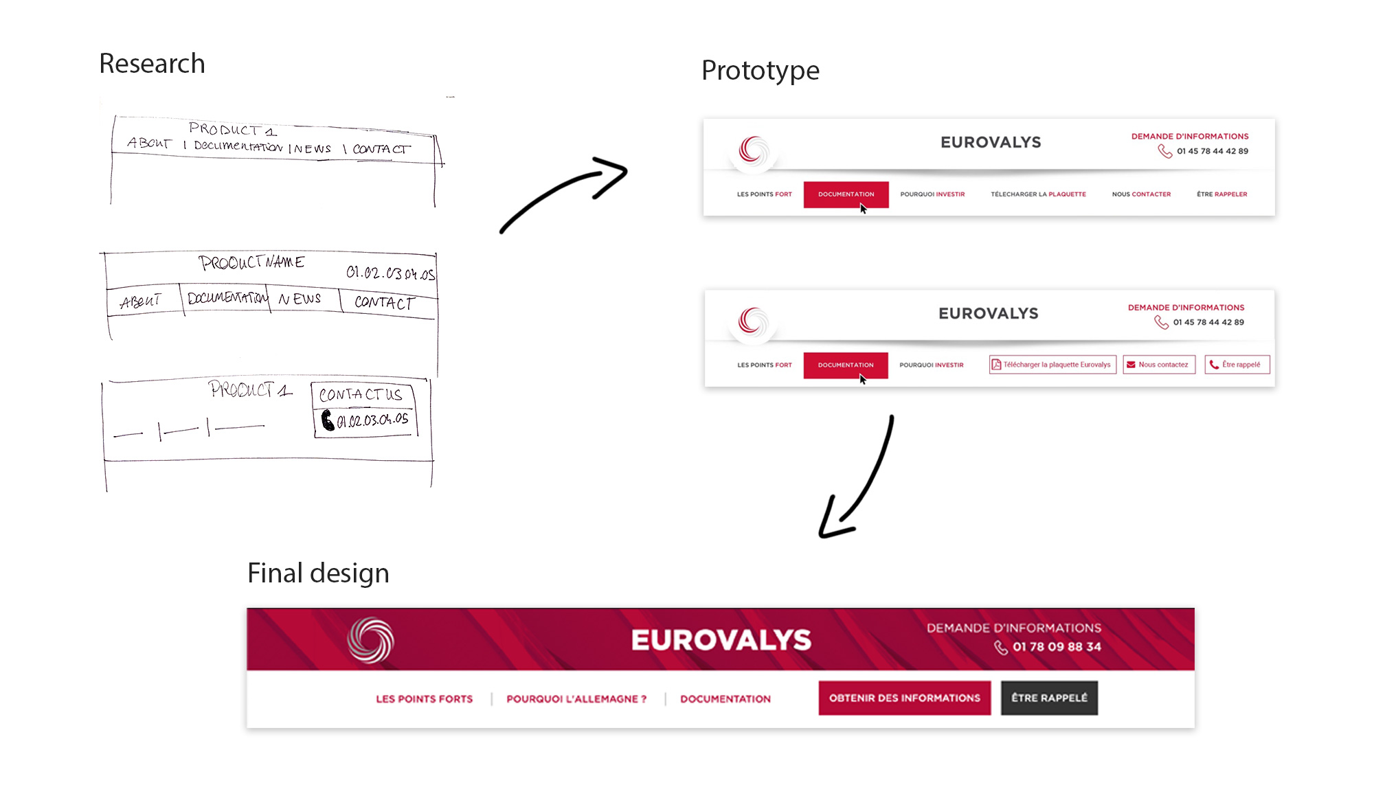
In addition to the main navigation menu, to improve the navigation through long product pages we decided to put anchor item on a sticky menu, we limited our choice if the sections the user told us to be the main ones : Advantages of the product / Why chose it / Documentation / Contact form

2. A smart way to communicate

Financial real estate investment can be very complex to handle and the majority of the users will ask for information or advices. Depending on the level of expertise we defined two main user profiles :

  • Those who want to understand by themself before asking for help
  • Those who want to be in contact with advisor since the beginning

But in the end they all need to be in contact with the company, meaning loads of calls and mails to take care of quickly. That’s why they ask us to help them to improve their contact system, for us it implied 2 sides :

  • An easy way for user to contact the company and show what they want
  • An efficient system to sort mails and calls for Advenis' employees, targeting the right branch and person

In order to fill those goals we created specific forms:

2. A smart way to communicate

Financial real estate investment can be very complex to handle and the majority of the users will ask for information or advices. Depending on the level of expertise we defined two main user profiles :

  • Those who want to understand by themself before asking for help
  • Those who want to be in contact with advisor since the beginning

Responsive image
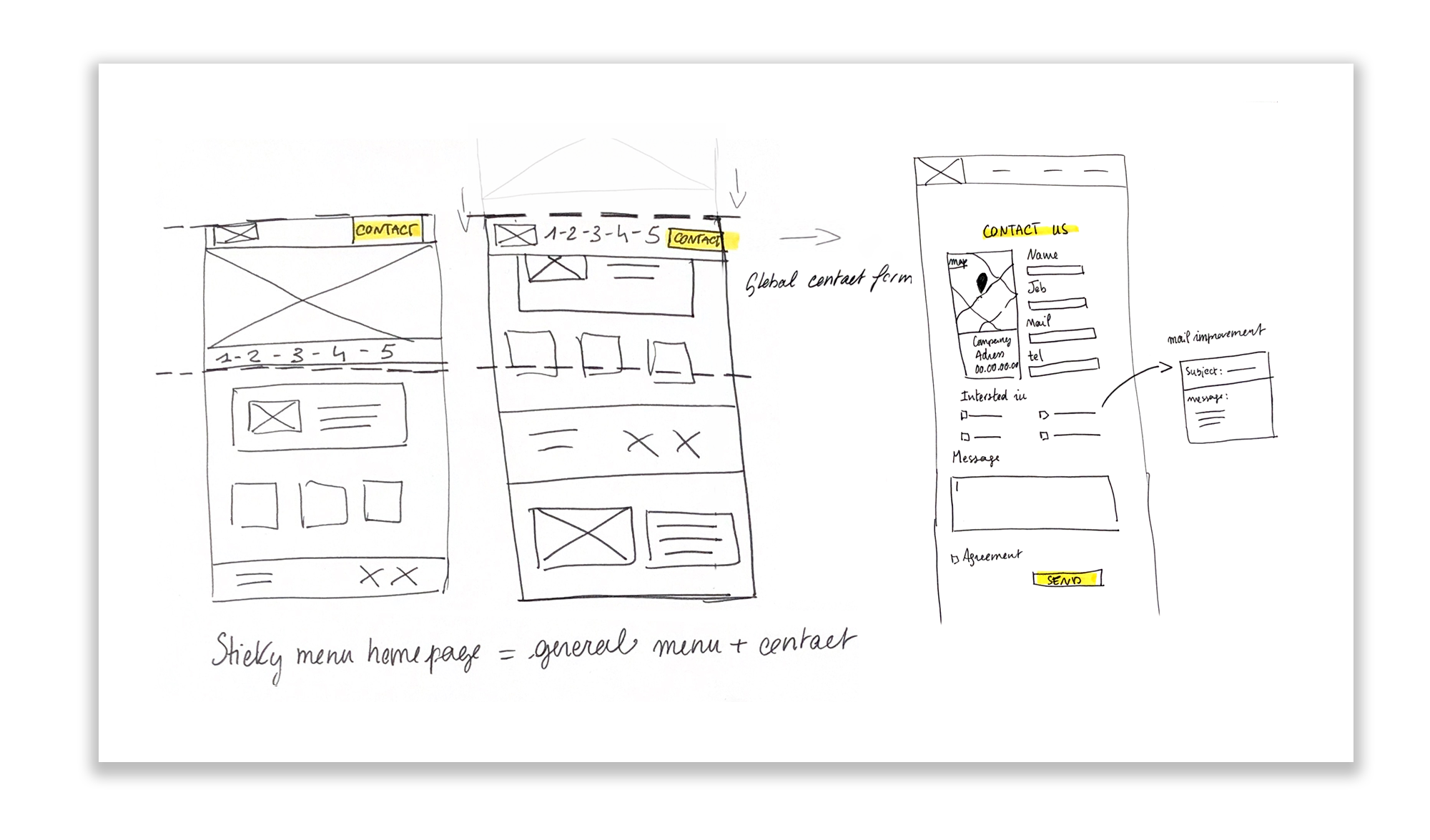
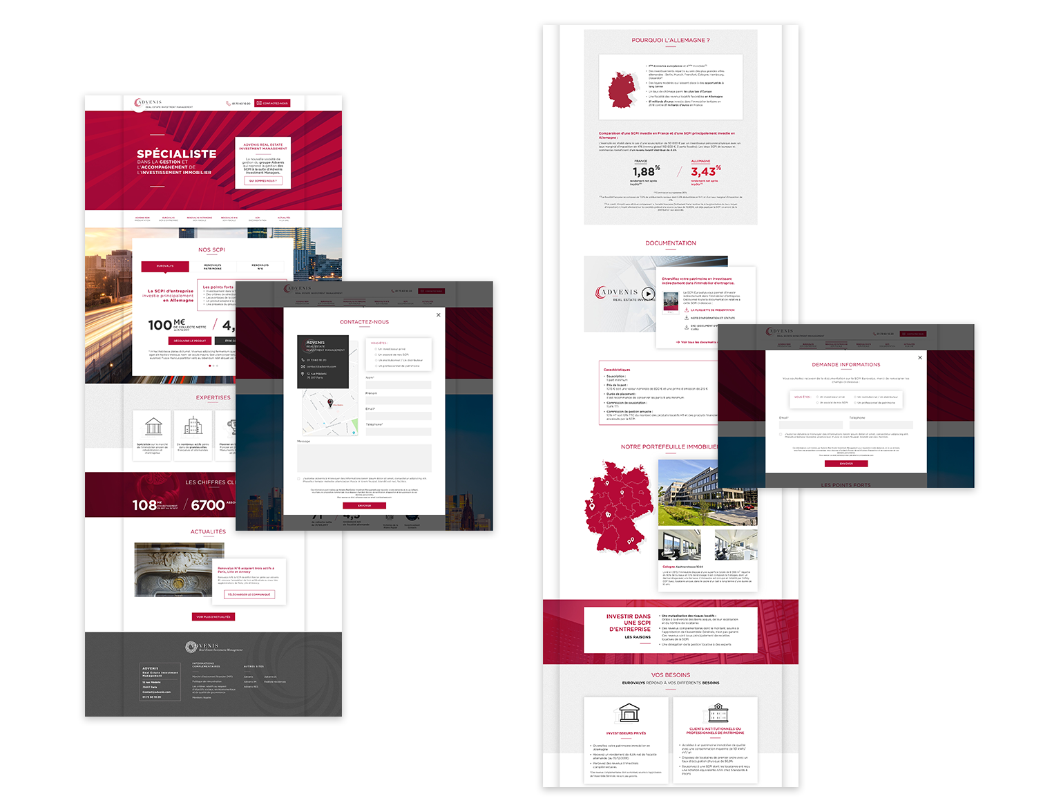
Responsive image Contact : General one for the homepage and header of pages, and contact page
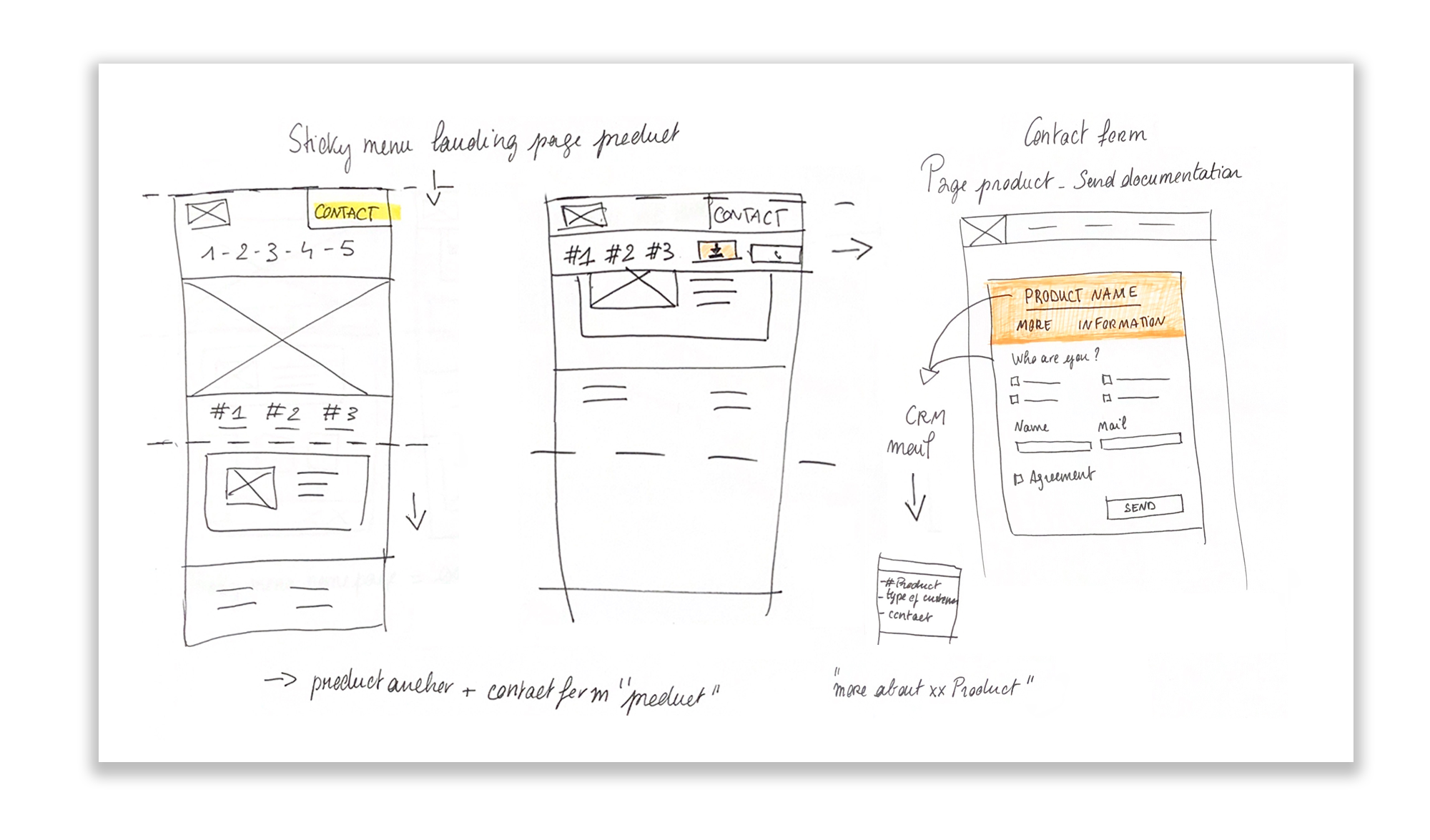
Responsive image Product : A specific one for the product landing pages with 2 differents access "Call me back" or "Send me more documentation" > shorter, focused and with the minimum informations required depending on the request (phone or email)
Responsive image
Find the right place
If you can find the contact form on every pages via the main menu, the product form, appears when scrolling a product page, so we can imagine that the user is already interested by this product and want to know more about it. They then have to choice to ask to be call back or to be sent documentation.
2.3 Delivering the right information
On the other hand we designed the forms to be easily handle by employee to respond :
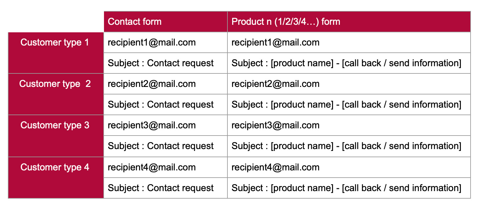
  • Different recipient for each product's form and depending on the information we have about the user (which form they used, which kind of clients, what do they ask for) all those data are used to target the right person to send the mail to
  • If the form used was a product one we, of course, create specified mail object showing its name
Responsive image
Responsive image

Learnings

With this project, we confirmed the believes we had : good architecture of information + dedicated features help to reach users' needs and clients' goals
Team
  • Project director : Martin Ferronnière
  • Graphic design : Bich
  • Web developement : Giovanni Baptiste - Cédric Questel
Delivrables
  • Sketches
  • Zoning
  • Prototypes
  • User guide